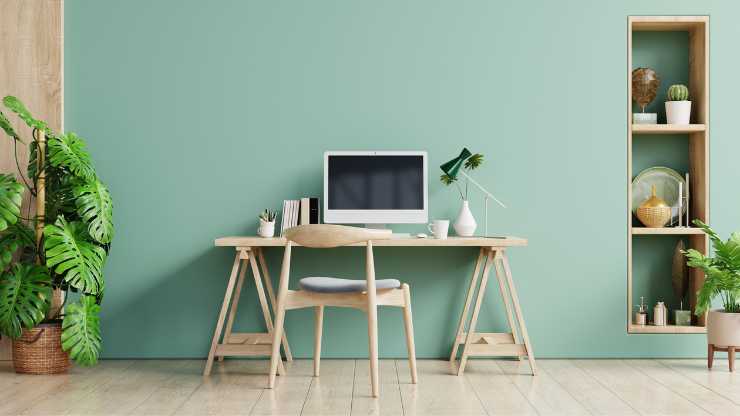
Wondering why your home office doesn’t quite inspire you? The problem might not be your desk or chair — it might be the color of your walls.
Welcome to the fascinating world of color psychology.
Ever noticed how different colors make you feel different ways? That’s color psychology at work!
By understanding it, you can transform your home office into a space that boosts your mood and productivity.
So, how about we dive right into it?
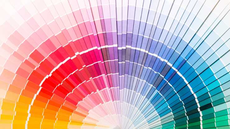
What is Color Psychology?

Color psychology is the study of how colors can influence our emotions, behaviors, and decision-making processes. It’s a crucial element in fields such as marketing, branding, and interior design.
For example, have you ever wondered why many fast-food restaurants use the color red in their branding? That’s because red can stimulate appetite!
But color psychology extends far beyond marketing and branding; it seeps into our everyday lives, impacting how we perceive and interact with the world. The individual color of our clothing can reflect or even affect our mood, and the hues chosen for our living spaces can either energize or calm us.
Even the colors used in schools and hospitals are carefully chosen based on color meaning, aimed at fostering a conducive learning environment or promoting healing.
Understanding color psychology can help you create environments — including your home office — that promote desired feelings and behaviors.
The relationship between color and psychology is an ever-evolving field of study, with researchers continually discovering fascinating insights about how color affects human behavior and cognition.
Whether we realize it or not, color plays a constant and significant role in our lives, making our interactions with the world more vibrant and meaningful.
Applying Color Psychology in Your Home Office

Before you grab your paintbrush, let’s delve into how color psychology can transform your home office. Every color has a unique psychological effect — it can either stimulate or relax our mind.
For example, a cool color like blue is often associated with tranquility and productivity, while warm colors can stimulate creativity.
Beyond just wall color, you can apply these principles to all aspects of your home office: the color of your desk, the artwork on your walls, even your stationery can be chosen with color psychology in mind.
A thoughtfully selected color palette can do more than just beautify your workspace. It can help reduce stress, improve mood, and enhance productivity.
Moreover, personal color preference and cultural backgrounds also play a role in our color perceptions, so it’s essential to choose complementary colors that resonate with you on a personal level. As you apply color psychology to your home office, consider what each color means to you personally.
By carefully applying the principles of color psychology, your home office can become a place that not only promotes work efficiency but also caters to your mental wellbeing.
Applying the right color scheme to your home office can make a significant difference in your mood and productivity, turning your workspace into a tailored haven that inspires and motivates you every day.
The Impact of The 10 Main Colors on Your Workspace (& Life)
Are you ready to explore the world of color theory and its impact on your home office environment?
Here are ten colors and their color symbolism, complete with practical examples of how they could be applied in your home office.
So, grab your color wheel as we are about to find your new favorite color…
Red: The Powerhouse
Red, being a primary color, is both intense and stimulating. It’s the color of passion and energy, which can help in boosting your confidence for that next big client presentation. In fact, the color red has been shown to give an edge in sports.
In a home office setting, consider using red as an accent color — maybe a vibrant red chair or vivid art on the walls.
For instance, look at the creative workspace of famous contemporary artist, Damien Hirst, who famously uses splashes of red throughout his home studio. It can spark a dose of energy, making it ideal for workspaces where dynamic, high-energy activities occur.
Blue: The Calming Force
Blue, synonymous with the sky and ocean, is known for its calming and soothing effects. If your work involves deep analytical thinking or if you frequently find yourself under stress, blue might be your go-to color.
A blue wall, or even a few well-placed blue accessories, can promote concentration, lower your heart rate, and reduce anxiety.
Take inspiration from the well-known Twitter headquarters, where varying shades of blue create a relaxed, yet focused environment. It’s an excellent primary color for a home office.
Green: The Innovator
Green, the color of nature, fosters balance, harmony, and innovation. If you’re someone who spends long hours in the office, a touch of green can provide a restful ambiance, reducing eye strain and enhancing vision.
This principle is utilized in the design of the headquarters of environmental organization, Greenpeace, where various shades of green pervade the workspace to foster a sense of balance and connection with nature.
Adding green elements to your home office, like a soothing wall color, potted plants, or green-toned accessories, can make your workspace a fertile ground for fresh ideas, encouraging you to think outside the box and come up with revolutionary solutions.
Yellow: The Optimist
Yellow, the color of sunshine, is full of positivity, optimism, and creativity. It’s a great color to use in a home office where brainstorming or idea generation is a regular activity.
When applied in a home office, yellow can help stimulate mental agility, making it an excellent color choice for spaces dedicated to learning, brainstorming, or creative pursuits. A pop of yellow can reenergize a tired mind and inspire a sense of adventure.
Take a cue from creative agencies like Lego’s Denmark office where bright yellow walls stimulate creative thinking. However, remember to balance it out with cooler tones, as too much yellow can induce feelings of frustration and anger.
To tap into yellow’s vivacious energy, consider incorporating it in thoughtful doses, like a sunlit wall art, vibrant post-it notes, or a zesty desk lamp.
Orange: The Enthusiast
Orange, a perfect blend of red’s passion and yellow’s joy, is a warm color of enthusiasm and creativity.
As a shade that personifies exploration and fascination, it’s an ideal choice if your work involves creative thinking, lively discussions, or if you’re in an energetic field like content creation, event planning, or digital marketing.
One inspiring example is the workspace of Nickelodeon Animation Studio, which has creatively incorporated the playful use of orange throughout their office.
This lively color reflects the buzzing energy and youthful spirit of the studio, making it an exciting space for brainstorming and cultivating ideas
Purple: The Deep Thinker
Merging the tranquility of blue with the fiery passion of red, purple embodies the best of both worlds. It’s a color that stimulates deep thinking while fostering a sense of calm and peace.
The richness of purple can stimulate the imagination, making it a perfect color for roles that require creative problem solving, like strategic planning or writing.
Notable for its use by Yahoo’s former CEO, Marissa Mayer, who painted her office purple, this color has been adopted to inspire innovation and encourage open-minded thinking.
A dash of purple in your home office can act as a creative catalyst. It might be a purple painting, a lavender-scented candle, or a plush violet chair that becomes your thinking throne.
Brown: The Stabilizer
Much like the solid earth beneath our feet, brown brings a sense of security, strength, and stability. It’s reminiscent of the steadfastness of trees and the reliability of the soil, creating a calm and comforting aura.
In a home office setting, brown can lay a solid foundation that soothes the mind and encourages focus. It’s a color that fosters a natural flow of thought and boosts your ability to handle demanding tasks.
For an example of brown’s grounding influence, Starbucks, a company that has mastered the art of creating a cozy environment, uses this color scheme in their stores worldwide to instill a sense of comfort and reliability.
White: The Simplifier
White is more than just the color of purity and simplicity — it’s a canvas upon which creativity can blossom. This hue can make your office feel not only spacious and clean, but also open-ended, encouraging limitless creativity and fresh beginnings.
It gives the sense of a blank slate, a page waiting to be filled with vibrant ideas and innovative solutions. Reflecting light, it creates an illusion of a larger, more airy space, thus reducing feelings of confinement that small offices can sometimes create.
Renowned for their clean and minimalist designs, Japanese architects like Tadao Ando often use white to create peaceful, harmonious environments that promote clarity of mind.
For a touch of sophistication, consider pairing white with carefully chosen splashes of color to prevent an overly sterile look.
Black: The Sophisticate

While it’s true that black has negative associations, it’s also the color of strength, power, and sophistication when harnessed correctly. It brings to a space a sense of gravity and depth, a depth that draws you in and makes a strong statement.
Used wisely, black can give your home office a dramatic, powerful edge. It can underscore other colors in the room, making them pop, and adds an element of surprise to an otherwise typical office environment.
A sophisticated color, black has been used effectively in many corporate environments to create an atmosphere of prestige and exclusivity. Look at the offices of leading fashion magazines like Vogue, where strategic uses of black exude a sense of chic authority.
However, to avoid an overly dark or oppressive feel, it’s crucial to balance black with lighter hues or incorporate it into specific elements of your office, such as your desk, shelves, or accessories.
Grey: The Neutralizer
A perfect neutral, grey is calming and balanced without making your workspace feel too sterile or cold.
Moreover, grey has a unique capacity to foster focus. It’s neither as stimulating as vibrant colors nor as potentially distracting as pure white. It can thus create an environment that encourages concentration and deep thought—precisely what you need for demanding cognitive work.
Consider the elegant home office of fashion designer Vera Wang, which employs a palette of grays to create a serene yet chic work environment. It’s versatile, pairs well with virtually all colors, and is great for a minimalist home office.
Paint Your World with Color Psychology
Feeling a little more enlightened about color psychology? It’s fascinating, isn’t it?
No need to feel overwhelmed — applying color psychology to your home office doesn’t have to be a daunting task.
Remember, it’s all about enhancing your work mood and productivity. Think of it as painting your workday with the hues that ignite your passion and stimulate your creativity.
So, grab your palette and let’s add some color to your work life!
After all, who said your home office should be any less inspiring than a rainbow?


